
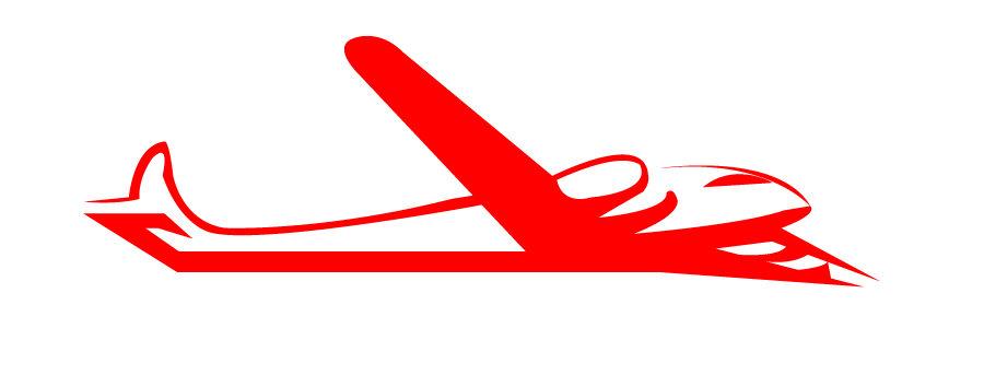
OK, folks. I’ve heard you. And with a gracious offer of help from loyal reader Gratuitous, I’ve restored the old banner image with his polishings.
Gratuitous — thank you, thank you, thank you. I think this banner image works extremely well, even though we’ve lost the Urban Trail girl. And many thanks to loyal reader Bill, who is the original designer of this banner that you all seem to adore so much.
I wish it could be narrower. And that there was another way to work in more Vegas-y elements, such as poker chips falling from the sky or by making City Hall resemble a one-armed bandit.
What do you think?


Thank goodness. I feel much better seeing the ol’ familar Ashvegas.
The poker chips seem really odd. I agree, looks like the ad for Cherokee Casinos.
I also agree that the image of Mount Pisgah is way out of scale and too tall.
No chips thanks.
This (banner) is definitely your ‘brand’. Work it until you like it.
Ashevgas v. Ashvegas? Ashvegas is very European. Ashvegas works better as a name. Ash Vegas. Here’s to you, Ash, keep up the good work.
This is good, but I liked the original better. Photos-rather than line drawings-look better (my taste only.) Whatever~I’ll read your blog no matter what the banner.
Yeah.. what Celo said.
-=WL=-
This one is a little bit better, but I still really much prefer the original one. Why did you change to begin with?
In this one the pic of Mt Pisgah is way out of proportion — way too tall — it does not properly reflect the scale of our mountains.
Also, I don’t see why there is a stream of poker chips streaming down the masthead……that looks like an ad for the casino at Harrahs in Cherokee…..just not necessary.
Please just go back to the original and stick with it. All these continuing changes drive me crazy!!!
You ask, and someone delivers. I like the 3-D feel to this, but less fuzzy photos would be nice.
I’m gonna like your blog no matter what your banner image is or isn’t. Like voting for the President, I read your blog for the content of the message rather than it’s pretty package;)
You finally outed yourself on the license plate!
Loving this one too — better than the last one.
Maybe you could replace the round thingys with flashing Christmas lights or flashing turkeys and make it seasonal!
A little late to the party, but I like the old Design. This seems just a bit too Rectangular, while the old one was not square at all but distinct.
MJ, just personal preference — I like the way "Ashvegas" looks, better than the other. And "Ashvegas" fits on a license place, while the other doesn’t. (There’s an eight-character limit).
Why don’t you spell it Ashevegas? It drives me crazy when folks spell Asheville wrong. Just a thought.