

Thanks to everyone who sent a message alerting me to a problem with the background color on my blog. No problem appeared with the browser I was using, but many of you said I effed something up. And you were right. So hopefully, it’s fixed now. Lemme know if it’s not.
Many loyal readers have also reacted favorably to my new blog banner. All the credit there goes to Shannon at Halcyon Printing, a kick-ass printing operation here in lovely Ashvegas.
They describe themselves as “a full-service digital and traditional printing service company, specializing in innovative garment printing and design.” That about sums it up. I’m telling you, these guys are awesome.
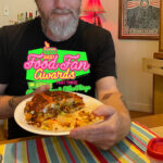
So I’m thinking of getting T-shirts printed up with the above design, minus the green background. Whaddya think?


I’d say, save a t-shirt for me!! 🙂
Second that, Gordon.
I’m with Jamunca.
I liked the previous logo better.. and it looked good on those T-shirts.
Giggle.
=WL=
I made the previous logo, and I was tired of looking at it.
I think the new one is great.
Rock on!
Ash, can’t say I am a fan of the new header either. I can’t offer an educated opinion, but what little design sense I have says, ugh. Your blog deserves better, IMO.
Saw you on the steps today at UNCA. I couldn’t say hi because you were on the phone and I was on my way to class, but from me to you: Hey, and thanks again for all the great blog entries. Hope your talk went well.
I asked a mass com student what he thought of your appearance and he nodded in approval and said you are a "smart guy." Gouge is THE BOMB, IMO.
Thanks, Jamunca. No offense taken.
I like the new banner! And your background’s looking normal.
It looks great in Firefox.
1) Background is fixed.
2) Perhaps I’m in the minority, but I’m not a fan of the logo. It looks like Ashevegas is some kind of cosmic hot dog in a bun straight out of a 1950s stylized version of what the future looks like. In other words (and no offense), I think it looks fairly hokey. I can’t be nice about this. The green marble background with the conflicting fonts and pastellish coloring just doesn’t sit right with me. Sorry.